We already know that making decisions based on data is the only way to grow a business. Now, did you know that there is a whole science behind data visualization and that the way you organize it can be decisive for its interpretation?
Human beings are visual creatures and, depending on the hierarchy of information in a report, we can feel suggested, confused, or, in the worst case scenario, with too much information to decide anything.
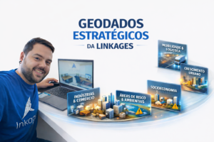
This is why Linkages follows certain standards of excellence when it comes to presenting data to our clients. Continue reading this article and learn about some pillars of our organization technique.
Timing is your best friend
Peter Drucker once said: “Time is the most valuable currency you have”…
Consequently, in an increasingly dynamic world, the ability to act quickly is often the difference between getting it right and failing. Especially when we are talking about business strategies in the corporate world.
In this sense, understanding scenarios, seeing the best path and acting quickly is part of the routine of any organization. Consider an example from the world of retail. During a crucial sales season, a large chain store noticed that sales were falling short of expectations.
Quickly, the data analytics team dove into the numbers, using data visualization tools to examine customer purchasing patterns in real time. It was there that they identified that sales were lower in certain regions because of a competitor that had just come into action.
Based on this quick understanding of the data, the company was able to make an agile decision to adjust its strategy, recovering from the downturn and maintaining its competitive advantage.
On the other hand, studies already prove what we are trying to say: according to a study by Harvard Business Review, companies that make quick decisions are more likely to outperform their competitors in terms of revenue growth and profitability.
So it's not just about having the right data, but also about how quickly we can turn that data into actionable insights, which makes the real difference.
But how can data visualization to help or to disturb this process?
For useful data visualization and accurate decisions: information design
Famous designer Edward Tufte says that: “The aim of information design It’s about bringing information to life, transforming it into compelling, understandable and meaningful stories.” This discipline, often underestimated, plays a crucial role today.
Although it has gained prominence in recent decades, information design has deep roots in the history of visual representation of data. A significant milestone dates back to the 18th century, when Scottish engineer William Playfair developed the first statistical graphs.
These innovations facilitated the visualization of complex data, revolutionizing the way human beings communicate. Playfair created bar and line charts, providing an intuitive way to visualize relationships between quantitative data.
Later in the 20th century, influential designers such as civil engineer and graphic designer Charles Joseph Minard expanded the field of information design. Minard is notorious for its maps and graphs that tell stunning stories through data. His famous “Map of Napoleon's March to Moscow” is a 19th-century masterpiece that depicts the tragedy of Napoleon's 1812 Russian campaign in an eloquent and visually captivating way.
This example demonstrates how information design can transcend the mere representation of numbers, evoking emotions and conveying complex narratives.
Today, information design is a fundamental part of the modern world, present in many aspects of our lives. From well-designed products and packaging to news infographics and enterprise dashboards.
That is, in an information-saturated world, the discipline continues to evolve and play an essential role in interpreting complex data into an accessible and meaningful format for the general public.
It all starts with…
- Simplicity: Nigel Holmes insightfully stated, “You’re not making a drawing, you’re making a way for people to read and understand quickly.” Simplicity is key to eliminating clutter and presenting information in an accessible way.
- Clarity: Clarity involves carefully choosing visual elements that eliminate ambiguity. The message must be transmitted without room for misinterpretation.
- Visual Hierarchy: Visual hierarchy plays a crucial role in guiding the viewer's eye and highlighting what's most important. Elements such as size, color and position can be used to create a content hierarchy.
- Visual Narrative: Additionally, effective visual storytelling is essential for telling complex stories through data.
These 4 pillars are the backbone of information design and Linkages strictly follows each of them in its reports. We consider that this is the only way to guarantee that all the complexity of the data collected will, in fact, be transformed into an accurate view of the market and more results for our clients.
And how does data visualization work in practice?

These principles about data visualization are not just abstract concepts; they manifest themselves concretely in a variety of graphic and visual communication formats in everyday life. From the application interface to the graphics on traffic signs, information design is an essential component in our relationship with the world.
A notable example is the use of bar charts and pie charts in financial reporting. These charts allow companies to clearly communicate the allocation of resources, revenues and expenses, keeping executives quickly informed.
Furthermore, the Gantt charts are a valuable tool for project management, allowing teams to effectively visualize deadlines, tasks, and dependencies.
Another example, this time applied to geomarketing, is the use of interactive maps, used to visualize customer distribution, identify areas of opportunity and optimize sales strategies based on geographic data. These interactive maps provide a spatial view of data and help companies become aware of the space they occupy.
Our world is driven by information, but Linkages is driven by results
Thanks to the application of these concepts, the Links has a clear market differentiator: personalized reports, easy to understand and straight to the point. This is because our team has specialized designers who spend their days developing strategies to make what is complex into something simpler, transforming mere numbers into stories.
In this way, we guarantee quality, updated information, available for quick interpretation and the valorization of your company's most valuable asset: the time.
Want to know more about our method? Schedule a meeting with us.